Sunday, May 8, 2011

Final Project for the Semester!!!

I recently finished my final project for my junior year in Interior Design.  We were to come up with three different solutions for a community clinic that is needed in the area.  The three solutions were to be different variations on a theme.  The theme was given to us by another student in class.

My project was a young women's clinic that provided sex education as well as medical assistance.  I named the company OAsis Services which stands for Optimistic Assistance Services.

Solution 1.

Solution #1 is a basic layout of  a woman's community clinic, using straight walls to maximize the space while making it work efficiently for the users.

Solution 2.
Solution #2 Was a slightly different take on Solution #1 adding in curved walls for interest and privacy.

Solution 3.
Solution #3 is the budget conscious solution.  Using construction and materials that won't break the budget, HOWEVER not boring in any sense.  Adding in diagonal walls keeps the space interesting and creates an "experience" for each user.

Sorry it took so long for me to get these posted.  It has been a VERY busy past couple of months, but... I'M BACK!!!

Monday, May 2, 2011

Happy Monday?


This image hit my inbox this morning from a great blog: SHELTER of whose e-newsletter I am subscribed to. It made me smile on this gloomy Monday. 

Hope you all have a great rest of the week!

Sunday, May 1, 2011

Apartment Love

I have been moving into my apartment since Friday, and it is definitely keeping me busy.  I am in a rush to get a lot of work done, because my last bridal shower is going to be hosted there.  For the past two days we have been painting machines.  So for todays post I have shown you some before and after shots.  It is no where close to being finished... due to lack of furniture and decor, but this just shows what a huge impact paint makes on a space!

The entry way before paint


Kitchen area before paint

Hall way before paint


Bedroom before paint

Entry after paint!


The color I chose is called Wedgewood Grey by Benjamin Moore


Kitchen after paint


Hallway painted wedgewood grey as well


The bedroom is painted with Chelsea Grey also by Benjamin Moore


The living room and the bathroom are to come! plus furniture eventually!  Stay posted.  I can't wait for you all to see it completely finished!

Oh yeah and studio project?! What studio project?  This is taking up all my time :)


Tuesday, April 26, 2011

Happy Pastels!

With Easter just coming to a close, I thought I'd look into spaces using pastel color palettes beautifully.  Most of my images came from a great website called Shelterness.  I personally, would not prefer to live in a home with pastel spaces, but don't get me wrong, these spaces are nothing short of fabulous and shabby chic.  


The mix of neon green and hot pink in with the pale blue and yellow add a pop to this spaces giving it a little bit more life and fun.  


I think this media room is great, and I"m only guessing that it is a media room from the pop corn machine on the counter top.  Um... Yes please! I want one :) Plus, how fun is the wall design?


Okay, okay, I think I could live in this space.  My fiancĂ©e, however, could not.  This pastel is so perfectly feminine and pretty. I absolutely love it.  The area rug = to die for.


These pastels are so much fun.  I love the gold accents added in which give it a regal feel.  The space is so fresh and clean like a high end hotel. 


This fabulous space is completely precious.  So perfectly shabby chic.  My favorite piece: the grey patterned ottoman in the background.


I feel like this space would be in a classic country cottage somewhere.  The light pastel colors provide a clean airy feeling to the space.


Again, so fabulous and chic.  I think every pastel color is incorporated into this space, but oh so perfectly.


The thing I love most about this space is the fact that they framed the wall paper. How cute?


Perfect little girls room.  The carpet works surprisingly well in this space.  And of course I absolutely love the fur ottoman!


This is probably the cutest kitchen I have seen.  It is so very feminine and perfect for the lady of the house.  

I hope that you have enjoyed these spaces as much as I did.  Pastels can take on such different character, it just depends on how they are used in the space and what is paired with them.  

I hope everyone had a great Easter and are enjoying all of that yummy candy :)

Monday, April 25, 2011

Style Your Apartment Pretty

I am moving into my apartment in less than ten days, and as you can imagine I am going crazy with excitement on everything I have planned for each space!  I was looking on apartment therapy recently and found some great spaces that I thought I'd share.  


This space is so chic and I absolutely love how she managed to make such a small space fit so many different uses.  The color in the bathroom will soon cover the walls of my living room and bed room :)  It is by Benjamin Moore and its called chelsea gray.


This space is so sweet and fun.  I love the different colors and patterns that actually work together.  


This apartment is completely gorgeous.  The sophistication just makes me smile.  I could never own a house if I could live an apartment with this much fabulousness forever!  My kind of pretty :)


Now this one has to be my absolute favorite!  The mix of grays, yellows, creams and browns is fun but still completely sophisticated and chic.  the femininity is present, but not overdone, which I absolutely adore.  

Check out Apartment Therapy's website for more great little spaces.  And stay tuned for pics of my new space, coming soon!

Happy Decorating!

Sunday, April 10, 2011

Current Project: Print Corp

The project that I just finished in Studio 6 was for a book publishing company that published Art, Architecture, and Design books.  The concept was based upon timelessness.  I wanted to provide the company a facility that endured through design "trends".  One that would represent them as a company who publishes the art of the past and today and preserves it forever.  


The floor plan has a curvilinear nature that directs people's paths and pulls them through the space.


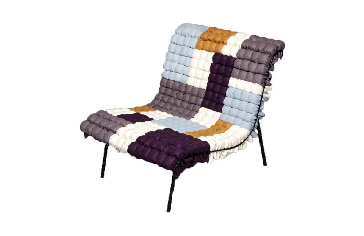
This chair is the inspiration to the color scheme that I chose.  When I first saw this chair I fell in love with the unique colors that you wouldn't expect to be put together.  I thought that it was original, exactly the kind of character I wanted for my office.


At the entrance of Print Corp you are greeted by the receptionist at a curvilinear desk that mimics the form of the mezzanine wall behind it.  In the background is a curved conference space that is open, or can be closed off if the privacy drapes are pulled all the way around the protruding ceiling element that creates the space.  The accessible ramp wraps around this space taking one up to the open office area.   


This section cuts through the plan from north to south.  It displays the open office area to the right along with the VP offices that have curtain walls on both sides allowing maximum sunlight to flood the large space.  The mezzanine to the left is shown with the conference room underneath completely surrounded by glass curtain walls.


The east-west section shows the entry way on the left and the transition from the floor to the mezzanine level.  In the center is the entrance to the large conference room underneath, and the rest are closed office spaces for the administration and financial department.


The view from the mezzanine shows the lounge area that can hold catered exhibit events or just provide a space for employees to meet and collaborate or even take a break for lunch.


The large exhibition space is designed to also hold the company's library of books.  The recessed shelves hold the company's archives, while the white shelves are for exhibition display.  The circular element that hangs out from the shelves mimics the shape of the circle conference space below, while also creating an interesting design element and bringing the space down to human scale, and because the ceilings are so high this is beneficial.  


The large open office area is broken up in the middle with the VP's offices.  These offices, like stated before, have glass curtain walls on both sides.  This enhances the collaborative environment and cohesive nature desired by the employees of Print Corp.  It allows every employee to get the maximum amount of sunlight available.  The ceilings are 18 feet high in this area and in order to keep the spaces at human scale and more intimate, dropped ceilings were introduced to 10 feet.  This helps create space in such a large area and it also helps with the acoustics.  

I hope that you have enjoyed looking at my design solution for this company!